Starting this August I'm going to begin sharing my five favorite eco-friendly finds of each month. This month I focused on eco-friendly home decor. If there is a product you have been desperately trying to source, leave me a comment below, and I'll see if I can find something to suit your style needs for future posts!
Showing posts with label interior design. Show all posts
Showing posts with label interior design. Show all posts
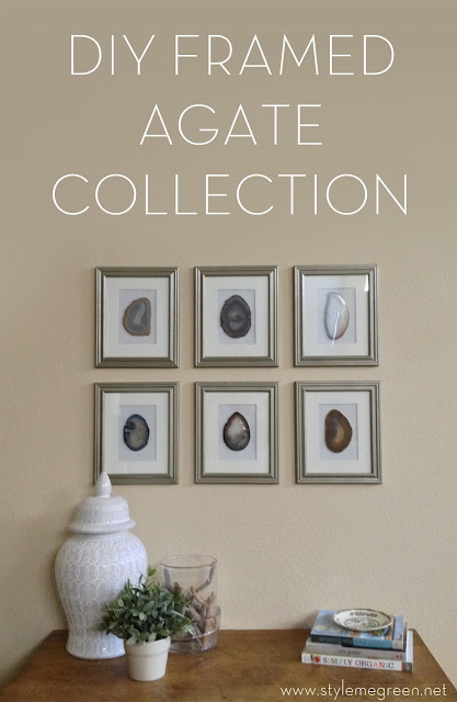
FRAMED AGATE COLLECTION
I have been searching for some interesting art ideas for the wall that is weirdly angled between our foyer and living room. We've had a movie poster hanging there since the day we moved in, 48" of Rita Hayworth as Gilda, in all her glory. I've had this poster since high school. (Yes, I was a super interior design geek even then- I felt like N'sync posters and the like cluttered the look of a room, but a framed movie poster was much more sophisticated.) So when we moved to our post-college home I wanted something a little less "teenage dream," and a little more "Hey, I'm a real interior designer, I promise." But it takes me forever to make design choices in my own home, so this is a huge step for us.
Even though John loves agates and geodes, and I love pyrite- we selected agate slices to frame, because they were thin, yet colorful and would add dimension to space. I ordered my agates from Sonya Masur on Etsy. Check out her shop, she has so many great stones, and her agate coasters were perfect for this project. I tested out one agate in a frame prior to purchasing, because I did not want a shadow box frame. and they were thin enough to rest against the glass, and still get the back of the frame on, I did have to pop the rubber feet off the back of the coasters, but they came off without a snag.
To complete the look I taped a piece of biscuit colored card stock to the back of my mat, and because I ran out of double stick tape I used a fancy tape loop on the back of the agate. Simple place the agate in the center of the mat and put the frame back together. I used frames from Michael's Craft Store, I also used the same frames for this project. And I stuck with my favorite brand of metallic spray paint, Rustoleum universal metallic - but this time I got the hammered metal, in the rosemary finish, it has a great greenish silver color. It's from Home Depot.
We tend to gravitate toward collections in this home because we have 12' ceilings, which makes for a lot of ground wall to cover- and because collections inspire us. We've always loved going to museums and spending hours in the natural history wings, wandering through the dioramas and gazing at the fossils. When I saw what was hanging over the tub in this showhouse in Utah I knew exactly what we needed for our space.
Even though John loves agates and geodes, and I love pyrite- we selected agate slices to frame, because they were thin, yet colorful and would add dimension to space. I ordered my agates from Sonya Masur on Etsy. Check out her shop, she has so many great stones, and her agate coasters were perfect for this project. I tested out one agate in a frame prior to purchasing, because I did not want a shadow box frame. and they were thin enough to rest against the glass, and still get the back of the frame on, I did have to pop the rubber feet off the back of the coasters, but they came off without a snag.
To complete the look I taped a piece of biscuit colored card stock to the back of my mat, and because I ran out of double stick tape I used a fancy tape loop on the back of the agate. Simple place the agate in the center of the mat and put the frame back together. I used frames from Michael's Craft Store, I also used the same frames for this project. And I stuck with my favorite brand of metallic spray paint, Rustoleum universal metallic - but this time I got the hammered metal, in the rosemary finish, it has a great greenish silver color. It's from Home Depot.
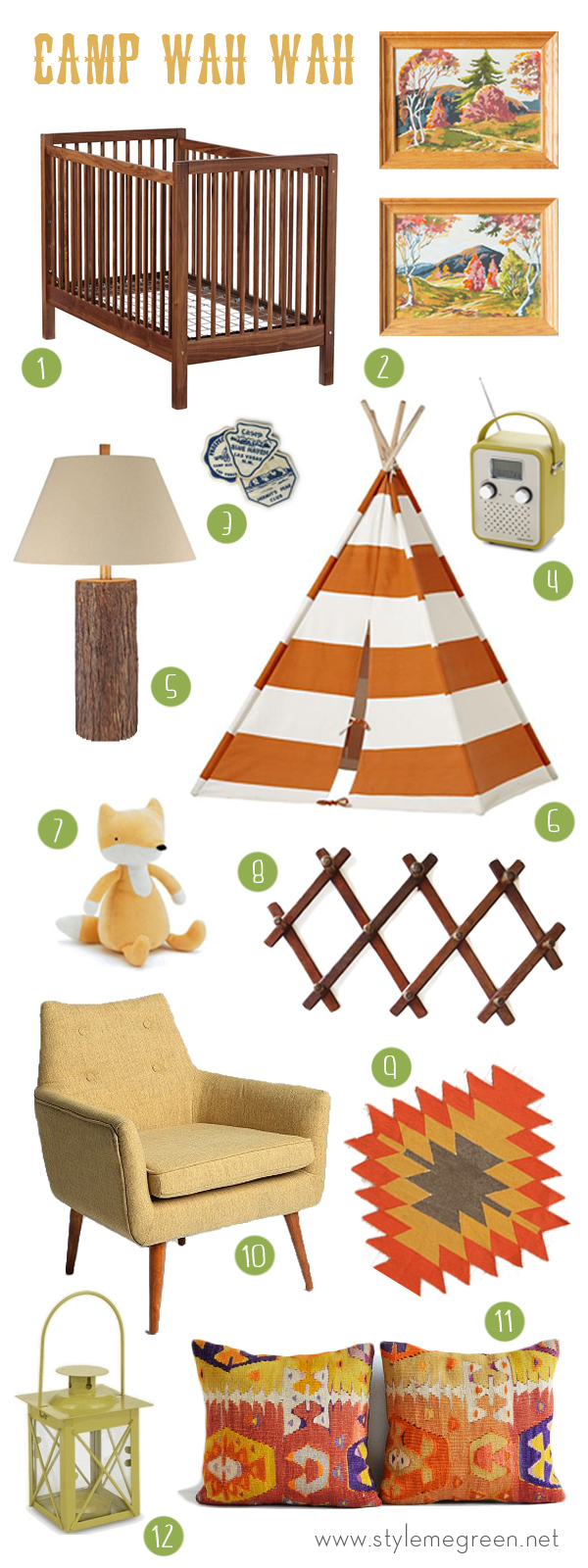
CAMP THEMED NURSERY INSPIRATION
Remember this post about nursery inspiration? How could you forget, it was just last week. In case you are just joining us, I was really inspired by a paint by numbers mural I saw on Land of Nod's website. It was my jumping off point for this design. A good friend was having a baby boy and asked me to create a fun, unique space that could grow with their son.
NURSERY INSPIRATION
June must be the month for having babies. I have had quite a few friends who just celebrated their babe's first birthday, and a handful more that are due later this month. If you know me well you know babies terrify me- I never grew up having baby siblings, and I have never changed a diaper in my life. I think I am the only person in the world with babyphobia. I used to teach kindergartners, I can handle toddlers and small children, its just something about the unpredictability of a little human that strikes fear in my heart. But I LOVE designing nurseries, and play rooms. I recently designed a nursery for a good friend who is having a little boy later this month, here is where I drew some of my inspiration. I'll share my design board with you a bit later in the week!
I love the gold crib and draperies in this nursery. What a great idea to have a larger bed in the nursery in case you need/want to be close to your little one.
The simple owl print hung in an ornate frame above the crib really makes a statement in this space.
The backdrop of this nursery is all neutral with touches of green and coral in the accessories.
The rug in this room really sets the stage for a "world traveler" look, the map doesn't hurt either.
This green crib is perfect.
The paint by numbers mural in this room was a huge inspiration for me. I hope this room has a tee pee.
I love orange and pink for little girls, this room is fresh, and fun I loved the roman shade and window seat.
I imagine this room in a cozy New York apartment, I love that little felt cloud.
This neutral space is quite feminine, I really like how they incorporated texture to warm it up.
I was kind of dying over the antique crib in this room, and the gingham bed skirt just hit it home for me.
FERN COLLECTION FREE PRINTABLES
I have received quite a few emails about where I got the fern botanical prints in my bedroom, from this post. So, I thought I'd address the question with a new post and some free printables! I didn't purchase them anywhere, because I couldn't find ones that fit the frames I already had. Prints that did fit the frames, had a lot of other plants going on, and I just wanted a basic fern, no extra jib jab. So I ended up photoshopping my own prints from old scans I found at an online library archive. Library and museum archives are a great way to get a collection of prints if you are trying to achieve the look of a gallery wall for less, many of them have online scans. You can get my fern collection by clicking here.
I simply printed them out with a basic color printer and placed them in my frames. I got these frames originally at Michael's craft store about 5 years ago, but they still sell the exact frame in a few sizes. (I have another fun tutorial coming up with these same frames) I believe they were 9.99 -- and they were all 50% off, so wait until they have a sale. I should also mention I spray painted them with my most favorite gold spray paint of all time- nothing compares- really. You can get it here. It looks like this:
CHOOSING THE RIGHT BACKSPLASH
Add a touch of pattern
Try a natural touch like pebbles or bricks.
Mix it up with metal
Renting? Try painting a backsplash it’s affordable and far from permanent
*Note two of the images have a watermark so I know where they came from-- but the rest were saved on a file on my computer before Pinterest (how did we even live before Pinterest) If you know the source please send it to me, I'd love to be able to link them!
SUSTAINABLE INTERIOR DESIGN
I am so excited to be guest posting over at Life in Green Blog today. Liz contacted me a few weeks ago about teaming up to share some fun sustainable design ideas for your home. Stay tuned because on Tuesday she will be sharing all her eco wedding tips!
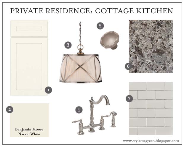
PRIVATE RESIDENCE: COTTAGE KITCHEN
I have been working with great clients who have a 1940's cottage, and they are renovating their original kitchen. They wanted a clean, contemporary space that was reminiscent of the style of the home. They have been using vintage dishes because the plates from their new set won't fit in their cabinets! Their only design must-haves were simple, white cabinetry and stainless appliances. I love them already. Here is the design board I came up with for them. I am installing the project in mid Spring, and can't wait to share the finished product with you!
PANTONE COLOR OF 2013: EMERALD
The color experts have come out with their trends and predictions for what's going to be hot in 2013. Pantone named Emerald their 2013 color of the year, and to tell you the truth I couldn't be happier. I think this shade of green is the classiest color out there, with a deep plum at a close second. Here are a few of my favorite accessories and spaces featuring this festive jewel tone. What do you think about their choice?
THANKSGIVING TABLE INSPIRATION
I can't believe Thanksgiving is next week, and whether your taste in tablescapes is subdued or sumptuous, get ready to give thanks in style. Check out this collection of photos of beautiful Thanksgiving table settings, centerpieces and accessories for ideas and inspiration.
HOW TO STYLE YOUR SOFA
One of my design pet peeves is when a homeowner buys a sofa, and it sits in their living room with the matching pillows that it came with. But I can sympathize, you take time selecting the perfect piece at the right price, and you have been convinced that that is how it is "supposed to look." It is hard fore many of my clients to see that it is okay to replace those pillows with some new ones that coordinate with their sofa and the decor in the room. In fact, many times you can just take off the cover that came with the pillow and purchase/make a new one. So here are a few tips on how to style your sofa.
Select a matching pair of pillows that are either 24 or 22 inches square to place on the far right and left of the sofa, I like to call these the "anchor" pillows. Work your way to the center with a set of slightly smaller square pillows.
Mix and match your fabrics, sofa upholstery and pillow fabrics should never be the same. If you have a solid fabric on your sofa use a print on your anchor pillows to ground other pillows, and vice versa. Limit patterned fabrics to one set of pillows per sofa.
I don't like to have more than 5 pillows on a sofa, I think it just gets too cluttered after that. If you want to add an odd shaped pillow to the mix to keep the look from feeling too symmetrical, include a smaller, rectangular pillow made from a third fabric that's different but coordinates.
I like to use down inserts rather than polyester inserts. They are more comfortable and better looking. If allergies are a problem, try high-quality, hypoallergenic down.When you fluff the pillows give the top a gentle karate chop, just to get the slight "v" shape. (its hard to do this with polyester filled pillows)
If you stick to those simple rules you will be headed in the right direction, and take it from me- as long as your sofa doesn't have built in cup holders, you'll be miles ahead of the curve.
Here are a few of the rule breakers and why its okay:
In this sofa they stacked the tallest pillows in the middle and the shortest on the edge. Its okay because the pillows on the ends are the same size and they alternated the color and patterned pillows.
In this room they left matching pillows on the sofa. In this example they placed a matching pillow next to a solid pillow to vary the layers. If you want to keep your matching pillows, try layering them on the inside and using a contrasting pillow as the anchor. If your matching sofa pillows coordinate with other upholstered pieces in the room try putting them on those pieces.
DESIGN INSPIRATION
Welcome to the new look of Style Me Green. It hasn't changed a lot, we just got a mini face lift. I was inspired over the weekend to change the signature green to more of a deep teal green. Where did I find the inspiration you ask? My Pinterest page of course. While "watching" the Bears beat down on the Titans on Sunday (my Fantasy team killed it by the way) I was perusing my living room boards and was surprised at how much blue/green was there. (I am a notorious grey/white girl) But maybe secretly I'm in love with Jade and Teal. Just take a look for yourself.
I am pretty sure that this is a subtle sign that I need a new sofa, because I had pinned this image twice! I love the long pillow on the front of the sofa.
So while I watched the electoral votes roll in I pulled together a new color scheme and just rolled with it. Like a new haircut I am still living with it, but loving it so far. What inspires you?
HIGH POINT FAVORITES
I finally got around to unloading my ipad and phone of all the shots I snapped at High Point. Here are some of my favorites.I had so much fun, my feet were killing me, but it was all worth it. There was so much inspiration, and I was able to source a lot of things for current projects.
I love this bed, I'd even take it in the display size
This carved lamp was so gorgeous in person, the finish was amazing and they had the perfect cream linen shade to top it off.
These framed intaglios were a highlight for me. We saw them at quite a few showrooms and I think they look so sharp framed in the gold with the detail on the edge of the mat.
I not only love the shape of this nightstand, but the hardware was perfect. I am a sucker for a great tassel or ring pull and these were the perfect addition to this feminine silhouette.
This pillow was one of my favorites at market, I've seen this detail done on pillows before but these guys did them so well. If there was a heaven for pillows you'd see it below.
The re-CYCLER had all these great bikes hanging on display, I thought it was so funky.
Love this finish.
This table is one solid piece of carved stone, beautiful! I also loved the cabinet behind it.
Subscribe to:
Posts (Atom)


